

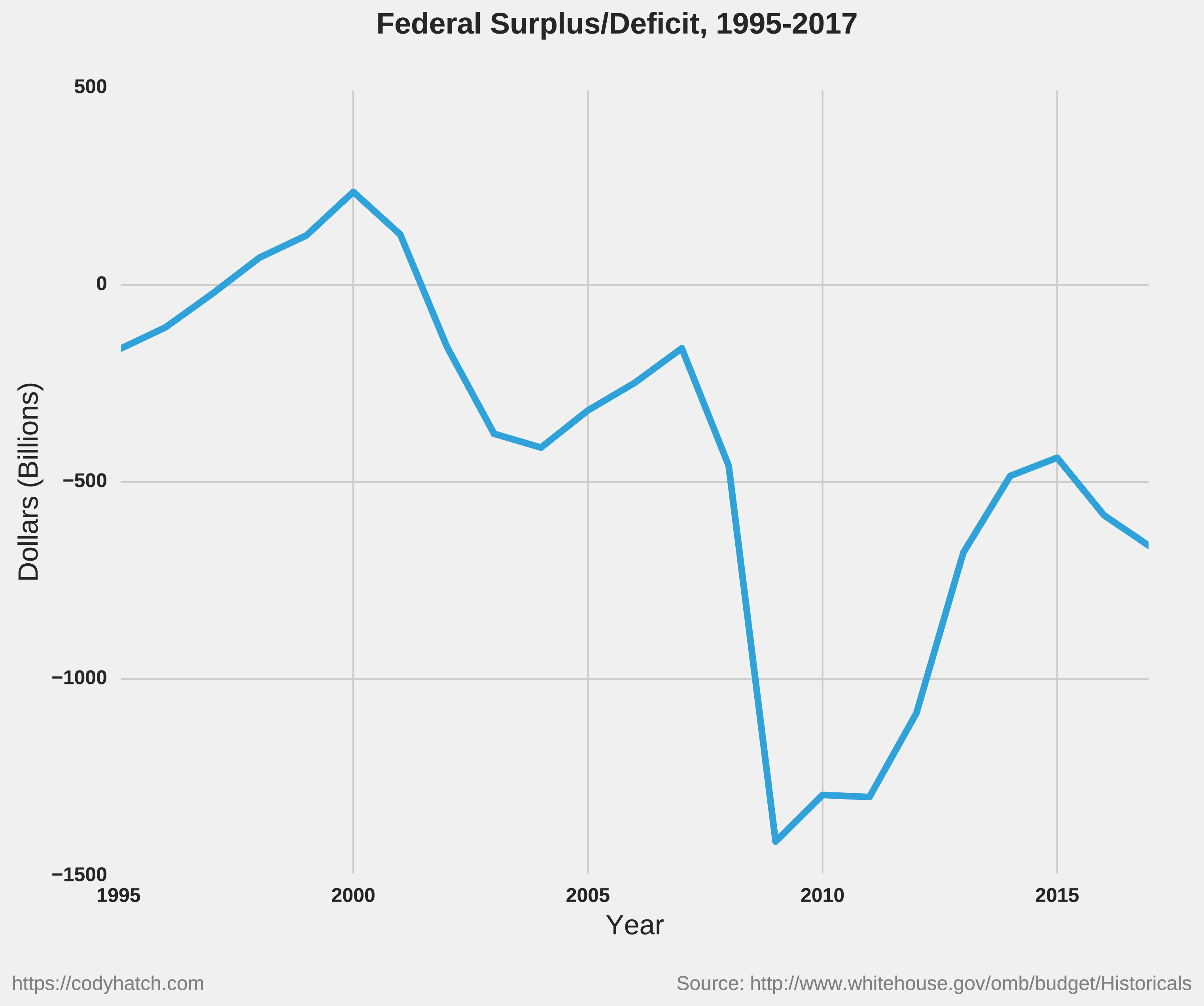
A recent Bloomberg article mentioned that the budget deficit for the 11 months ending in August was $898 billion, far more than was forecast. The article breaks down the shortfalls and the projected future deficits of up to $1 trillion.
I figured I would post a project I’ve been maintaining for a while where I graph the annual budget surplus/deficit, revenue breakdown, and spending categories for each year since 1995. My graph only goes through 2017 because I wait for the end-of-year tally, but it shows how much of the spending consists of national defense (which, following 2001 ballooned to eat up more and more of the budget), Social Security, etc.

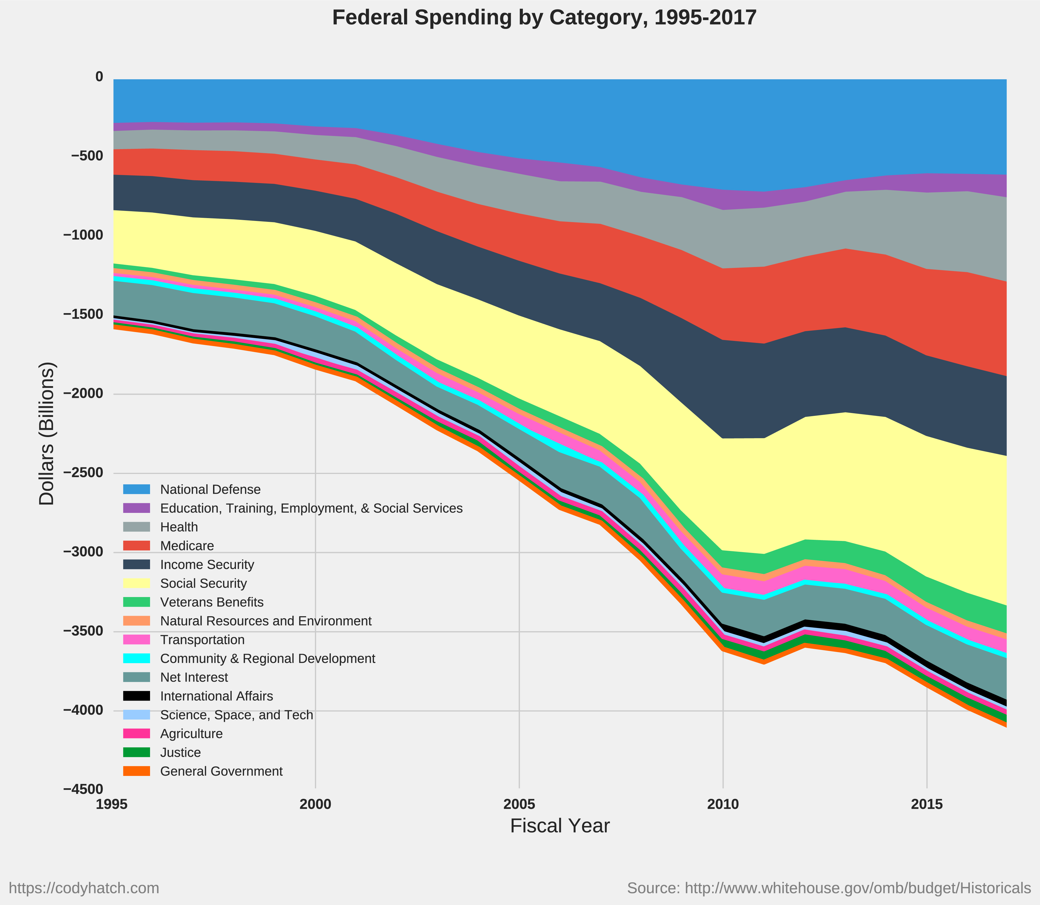
[Note: the category of “Health” is a bit ambiguous but, according to the source data, consists of health care services, health research and training, and consumer/occupational health and safety. The category of “Income Security” almost completely consists of federal employee retirement and disability, and unemployment compensation.]

Interesting numbers, thank you for posting. I view the federal government’s fiscal problems as the largest threat to my long term quality of life, possibly even a greater risk than poor health. I’m 25 years from retirement and I’m investing / saving as much as possible but I fear it will all come to naught with a giant crash, crazy inflation, or pointless war. The worst part is that there’s not much I can do about it.
I always thought that targeted tax cuts should be entered as budget entries or expenses as well. When you do that it creates an amazing picture.
That said, reducing the deficit is the most important national defense budget item I can think of.